
Good course, it teaches you the basics of typography.
Course Assignments for Introduction to Typography by Calarts by Anther Kiley on coursera.org
3. 2021.11.05 Week 4 Assignment - create a typographic poster.
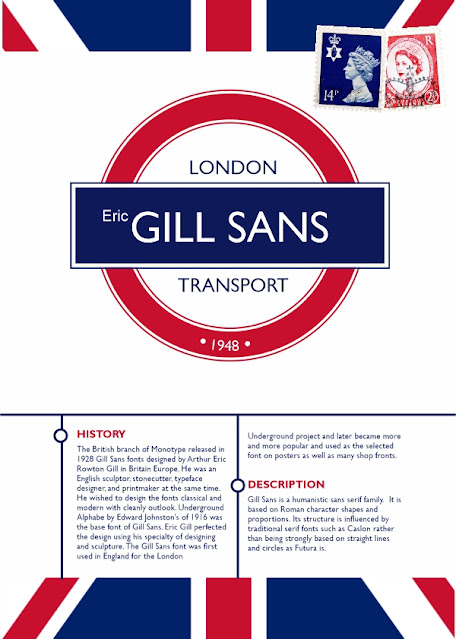
Gill Sans looks like a classical but modern font. It looks best on an orderly design like the one for the London Underground.
2. 2021.10.26 Week 3 Assignment - format the 2 paragraphs written
1. Week 2 Assignment - research a type
History of the Gill Sans Font
HISTORY: The British branch of Monotype in 1928 released Gill Sans fonts designed by Arthur Eric Rowton Gill in Britain Europe. He was an English sculptor, stonecutter, typeface designer, and printmaker at the same time. He wished to design the fonts classical and modern with cleanly outlook. Underground Alphabe by Edward Johnston’s of 1916 was the base font of Gill Sans. Eric Gill perfected the design using his specialty of designing and sculpture. The Gill Sans font was first used in England for the London Underground project and later became more and more popular and used as the selected font on posters as well as many shop fronts.
DESCRIPTION: Gill Sans is a humanistic sans serif family. It is based on Roman character shapes and proportions. Its structure is influenced by traditional serif fonts such as Caslon rather than being strongly based on straight lines and circles as Futura is.


0 yorum:
Trimiteți un comentariu